
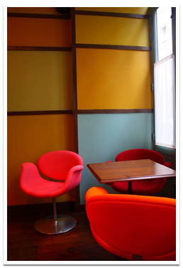
 CHOOSING COLOUR
WHICH FINISH WHERE?
COLOUR CONSULTATIONS
ENVIRONMENT
FAQ
TECHNICAL ADVICE
CHOOSING COLOUR
Understanding how colours behave is one of the most difficult aspects of decoration to get right. It has as much to do with light as pigment and often, neither is constant.
It's important to consider the amount and direction of light, natural and artificial, as well as the architecture, purpose and size of the room you are decorating.
Not all of us are experienced or have an interior designer on hand to help us choose colours. Before committing to a colour, plan where to make a definite statement and where to create sufficient emphasis to catch the light and eye. Use your natural intuition to instinctively pick colours that personally look right and are comfortable for you.
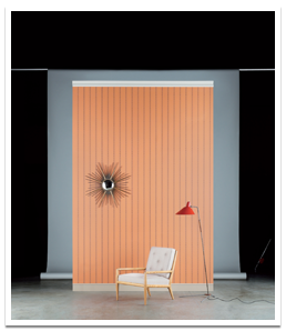
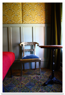
There are many ways colour can be applied but here are a few examples of the most popular painting styles:
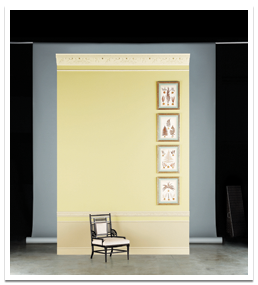
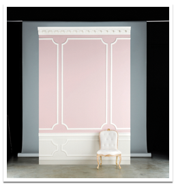
- Contrasting & Traditional: coloured walls and lighter woodwork; e.g., Slate IV walls, Slate II woodwork
- Strong & Classic: lighter walls and darker woodwork; e.g., Slate I walls, Slate V woodwork
- Clean & Contemporary: one colour used on walls and woodwork; e.g., Slate II throughout
Our approach is very simple. The best decoration is like cooking a delicious meal. Each ingredient and dish has a different flavour and texture that combines to create a satisfying result. Selecting colours is also like composing a piece of music. Each instrument has a different tone and note and when played together can be harmonious or not. Like sounds or flavours, some colours work well together and some do not.
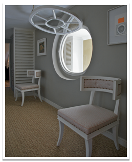
Sometimes the possibilities seem unlimited when combining colour schemes, but as a guide these generally fall into three types: monochromatic, related or contrasting.
Monochromatic
- Where one colour is used on walls and woodwork to create a strong clean contemporary look.
- It generates a sense of calm in a room, as well as exaggerating its size, since there are no contrasts to drawn the eye.
- Forms an easy to update background for furniture, fabrics, painting and objects.
- Favourite monochromatic Architectural Colours: Stone I-V, Slate I-V, Sand I-V.
Related
- Where one dominant colour is used with a calm companion and a supporting neutral on the woodwork and ceiling.
- Effective for continuity when used enfilade; reversing wall and woodwork colours in a suite of adjacent rooms.
- Ideal for finding colours to go with existing furniture and fabrics.
- Some suggested related colour schemes are Estuary, Stone IV and Stone I; Artichoke, Squid Ink and Glass I; Hot Earth, Suede V and Suede I.
Contrasting
- When complementary opposite colours are placed side by side or when two contrasting colours are used together.
- It generates the maximum amount of contrast and each colour can appear brighter and more intense than usual.
- Effective when used in a ‘ying yang’ proportional approach – to focally punctuate a favourite colour, object, painting, or architectural detail.
- Creates a feeling of light and space when a lighter colour is used on the walls with a darker contrasting colour on the woodwork; e.g., Tarlatan woodwork with Slate II walls or with stronger colours, for example, Tea Tree & Wattle V, or Trilogy & Rita Says.
![]()
WHICH FINISH WHERE?
CHOOSE THE PERFECT PAINT
For the best results, select paints intended for the surface you are decorating.
interior plaster walls & ceilings
Flat Emulsion
A matt, water based emulsion paint that dries to a soft, chalky finish. The high pigmentation gives a greater depth of colour than other modern emulsions. It is formulated to be micro-porous to allow the fabric of a building to breathe. Flat Emulsion is suitable for interior plaster walls and ceilings such as the drawing room, dining room, morning room, sitting room, study, library and bedrooms.
- Available in all colours
- Available in 125ml, 1 litre, 2.5 litres and 5 litres
- Coverage is up to 14 square metres per litre
- Environmentally friendly with minimal VOC’s (Volatile Organic Compounds)
- 2% sheen level
- Gently wipeable
Household Emulsion (Flat Acrylic)
A harder wearing water based household emulsion with a very low sheen level. It is suitable for interior walls and ceilings such as the hall, kitchen, well vented bathrooms, pantry, dairy, utility and playroom, or any other areas of high usage.
- Available in all colours
- Available in 2.5 litres and for colours indicated by * 5 litres
- Coverage is up to 12 square metres per litre
- Environmentally friendly with minimal VOC’s
- Less than 5% sheen
- Scuff resistant and wipeable
interior woodwork, metal and walls where a washable surface is required
Water Based Eggshell
This protective low sheen water based eggshell dries to a porcelain finish and is an environmentally friendly alternative to an oil based system. It is recommended for all interior woodwork, plasterwork and as a base for many decorative paint effects, all bathrooms that have poor ventilation.
- Available in all colours
- Available in 1 litre and 2.5 litres
- Coverage is up to 12 square metres per litre
- Environmentally friendly with minimal VOC’s
- 20-25% sheen level
- Washable
Oil Eggshell
A traditional, protective and durable, low odour oil based paint that dries to a low sheen finish. This flexible and hard-wearing eggshell paint is suitable for interior and exterior woodwork and metal, such as doors, window frames, furniture and conventional radiators.
- Available in all colours
- Available in 1 litre and 2.5 litres
- Coverage is up to 12 square metres per litre
- 20-25% sheen level
- Washable
![]()
COLOUR CONSULTATIONS
Since mankind discovered how to use pigments to decorate surfaces, colour has been a key element in interior decoration
Choosing a colour scheme is probably the most important decision you will make when decorating you home and the infinite number of choices can be overwhelming. To make your decisions easier, we are delighted to provide complimentary personal colour advice over the phone or in our London showroom. Whether you require assistance with just a few rooms or an entire house, we can help you to complete and resolve any particular interior design scheme.
If you’re suffering from ‘paint analysis paralysis’, then our on-site Colour Consultation service could be the answer. Our resident colour expert, Liza Mahony, will give you all the inspiration and expertise you need on colours and paint finishes in the comfort of your own home. Following the visit you will receive a detailed room-by-room specification, with paint and wallpaper samples provided for each recommended room scheme.
Consultations are priced at £180, including vat, per hour, plus travelling expenses for properties outside London. Appointments are available on Monday and Tuesdays or by prior arrangement with our consultant.
To make a booking please call +44 (0)20 7823 7755, ask in store, or email us at [email protected]
![]()
ENVIRONMENT
make an impact on your wall not the environment
With creativity comes responsibility and with beauty comes a duty. This is why we make every effort to minimise our impact on the environment and health.
All our paints meet and exceed either ZERO, VERY LOW or LOW, EU & USA regulations on VOC solvent content.
All our fabrics are hand-printed using water based dyestuff on highest quality and locally sourced linens. Our wallpapers are hand-brushed and blocked using environmentally friendly water based paints and traditional methods and our paper sourced from sustainably managed forests. For extra durability our papers can be coated using a fine water-based glaze.
![]()
FAQ
How do I creating an even flow of colour through the house?
Should the whole house harmonise, or can I have very different colours in each room?
When decorating an entire house I like to think about the wall treatments and colours in terms of composing a piece of music. You have available different instruments of design or colours available that all resonate and make a different visual sound. Some colours are louder and some are soft.
Having first identified which colours you like, think about modulating the value of each colour up or down in tone to connect different spaces, floors or suites. It’s best to decorate room to room, considering the sightlines and connecting spaces. Use darker tones of the same colour as a variation, but for continuity keep the woodwork colour in the same or similar tonal weight to complement the adjacent rooms, for example in a bedroom and connecting bathroom.
Another method I love is to paint one room then wallpaper the next, then fabric cover or tile and so on, using the same or similar shades. Using this technique it is easy to introduce pattern and texture to create rooms that each hold an individual reading but are still cohesive and related as a whole.
I have a dual purpose kitchen: one for personal use and one for entertaining. How do I find the right combination of colours that work for each setting and time of the day?
One of the tricks to making a dual purpose kitchen work is to make the area where dining happens feel a little more decorated. This may be achieved by lighting or by bringing a stronger colour to the table. For example, a kitchen with granite work surface and black walnut furniture works well with our Stone I, II, III, IV or V range. A colour such as Squid Ink could sit on one ‘Dining Wall’ to act as a backdrop and define after dark dining.
Alternatively another way to accent a second space is to use pattern to complement the kitchen colours. Wallpaper is often a great gear changer; softening and bringing texture or as a helpful extra surface to carry a stronger pattern or colour.
How do you choose the correct colour for an open plan layout?
A colour for an open plan layout should be something that supports other colour choices such as soft fabric, furniture and art work as all the areas of the living space are visible at any one time. Often open plan spaces are decorated in a white, using the architectural colour pallet where the first three tones really behave as a white may bring interest and perhaps some needed attention to detail.
Should ceilings be the same colour as room, or does this make the ceiling feel lower? How do I create more ceiling height using colour? When should woodwork be the same as walls?
In smaller rooms, attics with dormer windows, or halls with complicated turns and sloping ceilings on the underside of a staircase, or in rooms without cornice where the proportion of ceiling height to room width needs visual adjustment, are all places I would recommend painting the ceiling in the same colour as the walls. This simplifies the total number of colours in tight spaces and creates the illusion that your ceiling is higher and walls taller as you’re less aware of where the wall ends and ceiling begins. The same approach works on woodwork in smaller spaces which will help exaggerate its size as there are no contrasts to distract the eye.
In grander or larger rooms which often have a cornice. The cornice should be painted in a mid tone, 50% lighter than the walls and 50% darker than the ceilings. Frequently, for economic reasons, one sees a cornice painted as if it was part of the ceiling, and if this is done it is quite impossible to create the right balance because of the way light rests and reflects from the ceiling.
When is it right to use a colour other than white on the ceiling?
At Paint Library there are many colours that are almost white. All the number one tones in the Architectural range may be used as a ceiling white, and we have two beautiful just off-whites on our Original range – Chaste and Paarl. The advantage of using these whites especially in the English light is that they bring a warmth and continuity to the entire scheme. When a ceiling is painted brilliant white often cool blue/grey shadows are discernible in the cornice and cast down from the ceiling.
How do I choose woodwork colour to contrast with the wall colour?
The Architectural Colours are ideal for skirting board, wall and architrave combinations, as they were designed to help solve the problem of achieving the perfect companion colour. Each shade is arranged in a sequence of five chromatically graduated pale tones that can be used to find a suitable contrast and balance between various parts of a room whilst allowing each architectural element to make a statement. I like to create a slow crescendo of colour from dark to light. Woodwork painted in the same or a slightly darker colour than the walls creates a soft traditional feel and is ideal for avoiding the freshly painted look in period buildings.
Doors and architraves should be treated with similar care. One effective way is to paint the door itself in three tones of the same colour. The stiles and the rails should be in the darkest tone, the panels in the middle tone and the mouldings should be in the lightest tone. The same method can be applied when painting a traditional panelled, stuccoed or wainscotted room.
How do I make a room with little natural light work?
Most of us have a room lit like a dim museum that is not exactly benefiting from an abundance of natural light. The temptation is to paint it bright white to force it to feel brighter, but the results can be flat dull and grey. Instead use a warm, darker colour or patterned wallpaper to create a dramatic, more decorated effect.
As with any colour making decision the first question is what is also on the floor and are there any other colours already in use on curtains, rugs and blinds? Keep the floor and accessories pale and introduce a darker colour on the walls to hide any inconsistency of light. Versatile colours like Sand V, Lead V, Thames Mud and Tarlatan work well in basement kitchens or areas with limited natural light.
How do I making rooms feel lighter? Opting for a strong or dark colour, when does this work best? How do I choose the right colour? How to create the illusion of more space?
Colours can be used to alter the shape of a room. Where the walls are painted dark, the boundaries of a room tend to disappear creating an illusion of infinite space. It’s a technique I learnt at art school when studying life drawing: a dark mark on a white page recedes visually to the naked eye whereas a light mark jumps forward on a 2D surface. The trick for achieving this effect is not to paint the skirting board and ceiling pale. Otherwise a picture framing effect occurs bringing the perimeters of a room inwards as opposed to outwards. A darker wall colour with a white ceiling and skirting will bring the walls towards you, whereas the lighter colour on wall, woodwork and ceiling can create the illusion it’s further away.
Using dark colours in a hallway instantly makes adjacent rooms bigger and brighter. Walking from a dark into a paler room feels significantly and instantly lighter. I like to use strong and dark colours as a personality driver and punctuation mark in a scheme, and especially in hallways or rooms used usually at night. Dining Room, Study, Library, Billiard, Media rooms, passages and hallways, inside cupboards wardrobes or drawers, are all good places where strong colours can be used to great effect.
I have a north facing Dining room what can I do to cheer it up?
Often Dining rooms are painted red for a traditional gastronomic association, and with a north facing Dining room it is important to use an enveloping and warm colour. Sometimes wallpaper with a texture can be the answer to a rather gloomy space. Strong colours on wallpaper often sit down more easily than a flat paint and it can be glamorous to have a wallpapered Dining room.
What’s your favourite off-white? Whites for woodwork? Whites for ceilings? Whites for north facing rooms?
Because light has a profound effect on the way colour is perceived, the location of a room and the direction it faces is an important factor in your choice of colours since it determines the quality of the natural light each room receives. Morning sunlight is cooler (blue violet) than afternoon sunlight which is warmer (red orange). Rooms that face north in the UK have a cool blue cast which requires a warmer yellow, ochre or umber based white. My favourite cooler off-white is Slate I, II, III, IV, V, and warmer off-white Stone I, II, III, IV, V.
How do I tell the difference between a warm and cold blue?
Colours on paint charts like Paint Library often tend to be quite muted or muddy as eventually we are going to see them on a very large scale. The blues on the chart are far from primary and some, like Blue’s Blue, are very warm and some like Rita Says, are cool. When identifying if a colour is cool or warm you have to ask yourself what other colours are ‘hiding’ in the formula. If we can see yellow or red colours in the mixture the blue will be warm sometimes grey or black in a blue mixture may look cool.
What are some colour combinations that work well together?
When I was writing my book I was fascinated to learn of the rooms that were designed by Max Factor in the 1930’s in West Hollywood. Each room was painted a different colour and he insisted the models were made up in a particular room according to their eye and hair colour. For example, the redheads were all made up in a pale green room, the blondes in a pale blue room, and the brunettes in a pale pink room. These are combinations that work well together. Greys are especially popular at the moment largely because a good neutral will go with almost any colour.
Any advice for choosing coloured furniture and accessories?
When choosing coloured furniture and accessories the same rules apply as above. Accessories such as cushions and table wear can be as personal as our own clothing choice and work well as a colour statement inside a more classic scheme. Small amounts of strong or personality driven colour give a personal flavour to colour themes. Painting tired furniture can bring back elegance and bring a design driven decision to old favourites.
What colours work with antique furniture or pictures?
I’ve always been excited about the ways in which colours can be employed to transform a space, whether it is in the form of pictures, wall paint, carpets, wallpaper, furniture or fabric, and usually look to the colours mixed in the painting or fabric used on the furniture for a key accent or ‘hero’. I tend to like rooms that are not hermetically sealed but open to influence; a place that draws on its context and contents for inspiration. The possibilities are endless, and all combinations can be appropriate subject to what one puts with it!
Mixing your own colours: how do I to go about this? What do I use as a base? How do you make sure you have enough, or can I remix it if it run out?
Find the colour you want and get it bespoke-matched by eye. There are a number of companies including Paint Library that can colour-match for you for a small fee. The new colour formula will then be recorded and be able to be re-ordered again if the quantity runs out and you need another can.
What are the latest colour trends to look out for?
Interior colours like all colours in design do have prevailing trends. The colour seasons in interiors move more slowly than fashion and it may be a mistake to paint a room a colour of the season. ‘Trendy’ colours are almost always personality driven, and on a wall can become quickly disenchanting. It is best to keep trend colours to accessories and to support these colour choices with a classic neutral such as a colour from Paint Library’s Architectural range. When it comes to choosing colours it is best to perhaps, put trends with a capital ‘T’ aside and think about what suits the room. A more successful marriage between colour and environment is when colour is brought to the room rather than bending the room to the colour. Outside taste, rooms, like people, have colours that suit them depending on their light, function and size.
How can decorative paint effects be used?
Paint effects are well employed where a flat colour would be too dense. It’s a positive way of bringing texture and colour together. Paint effects are a wonderful substitute to a wallpaper or textured wall treatment. One of the most successful environments for a paint effect or paint finish is somewhere with poor light where flat colour will be unresponsive. On a practical note, a paint effect is useful on a hall, stairs and landing where high traffic may be anticipated, as marks do not show so readily. A matt varnish may be applied to the surface that appears to be textured and so holds the varnish more successfully.
Which finishes do I use and where? Is Eggshell better in bathrooms rather than kitchens?
Where protection rather than appearance is a priority, we would recommend a harder wearing paint such as an oil eggshell on all surfaces exposed to potential staining. As a general rule of thumb we usually use flat finishes for plaster walls and eggshell finishes for woodwork.
In kitchens, bathrooms or areas requiring regular cleaning, or prone to condensation from showers, or splashes from cooking, I suggest using oil based or water based eggshell, which is wipe-able.
When to use rollers, when to use paint brush?
Are there rollers that are as good as a paint brush and don’t leave an orange peel effect?
I only would use the best quality brushes or rollers you can afford. Cheap brushes shed bristles, which is very annoying. Equally, long bristles can apply too much paint, resulting in sags and drips. Long handled rollers substantially reduce the effort in painting walls and ceilings but can leave an orange peel effect. This is avoided by using a roller first, then brushing out at the same time whilst the paint is still wet. The leverage provided allows the smooth, even application of all finishes, but rollers usually apply a thinner coat than brushes, and therefore it can be necessary to apply additional coats to reach the desired colour standard. The use of successive thin coats assures even drying and precludes running, dripping and sagging.
![]()
TECHNICAL ADVICE
At Paint & Paper Library we are always looking at ways to help you understand our products better.
These downloadable documents will give you helpful tips and advice on paint application, hanging wallpaper, and all other technical questions that you may need answering.
If you cannot find a solution in the information below then email your question to: [email protected] or call the sales team on: +44 (0)20 7823 7755
To view one of the downloads you will need to have a PDF reader installed on your computer. If you don't have one already you can download it from: http://www.adobe.com/products/acrobat/readstep2.html
Information Downloads
Flat Emulsion
Household Emulsion
Water based Eggshell
Traditional Oil Eggshell
Wallpaper Hanging Instructions
Hand blocked Wallpaper Hanging Instructions
Retail Paint Prices
Terms & Conditions of Sale
Health & Safety Data Sheets
Flat Emulsion
Household Emulsion
Water based Eggshell
Traditional Oil Eggshell


Staff favorites